Picnic
alcoholic drinks, branding, digital communication, entertainment/leisure/culture, food, illustration, non-alcoholic drinks, outdoor, Picnic, restaurants/bars, sweet food/snacks, typography
When creating a visual identity for Picnic, we wanted to evoke the spontaneity and playfulness that Picnic will provide to its users. Much of the facility will be located outdoors, providing a picnic feel. During the design of the visual identity, we saw the biggest advantage in the name Picnic, and that is that it contains several of the same letters, more precisely the letters “I” and “C” are repeated. By separating the name into a new line, we achieve easier merging of the above letters. With this combination, we also achieve smiley emojis, ie a pictogram of a smile that we can clearly see by rotating 90 °. It can be...
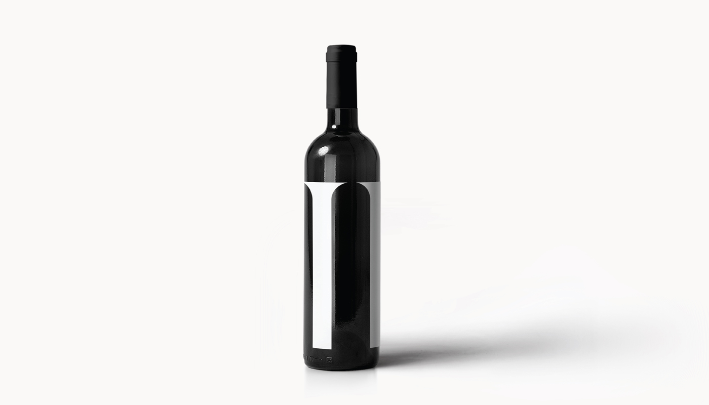
Continue reading this projectAfter the successful branding of the TI bar, it was the turn of the TI wine labels. The focus is still on Romanesque arches from which the logo itself was inspired by the strong signature of Zadar architecture. Wine is obtained from the Plavina variety 50 percent, while the rest consists of Syrah, Babić and Alicante varieties. The wine comes from Radovin, Ravni Kotari. We wanted a label that screams with minimalism and simplicity, and by applying the logo on the bottle, we achieved that.
Continue reading this projectZadar Gastro Club
alcoholic drinks, branding, digital communication, entertainment/leisure/culture, event, food, outdoor, poster, publications/media, restaurants/bars, travel/sport/tourism, Zadar Gastro Club
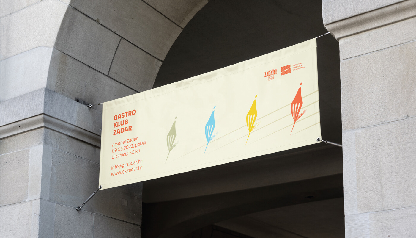
The main focus was on showing the diversity of gastronomy in general, including gastronomy of Zadar through a color system that contains 5 primary colors and their toning. The logo is based on a combination of wine and food, where we created a combination of a fork and a bottle of wine in movement. The display of toning is designed so that it is implemented in the title parts of promotional materials, and that each color represents its own category. Accordingly, blue would represent seafood, green vegetable, yellow cheese food, and red would represent wine/meat which alludes to the diversity of each of the categories. The fork/bottle in the movement...
Continue reading this project

