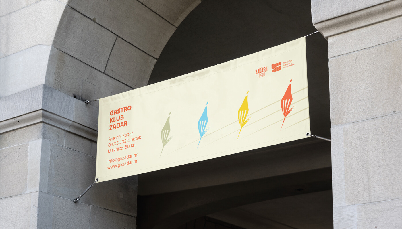
Zadar Gastro Club
alcoholic drinks, branding, digital communication, entertainment/leisure/culture, event, food, outdoor, poster, publications/media, restaurants/bars, travel/sport/tourism, Zadar Gastro Club
The main focus was on showing the diversity of gastronomy in general, including gastronomy of Zadar through a color system that contains 5 primary colors and their toning. The logo is based on a combination of wine and food, where we created a combination of a fork and a bottle of wine in movement. The display of toning is designed so that it is implemented in the title parts of promotional materials, and that each color represents its own category. Accordingly, blue would represent seafood, green vegetable, yellow cheese food, and red would represent wine/meat which alludes to the diversity of each of the categories. The fork/bottle in the movement...
Continue reading this project