Picnic
alcoholic drinks, branding, digital communication, entertainment/leisure/culture, food, illustration, non-alcoholic drinks, outdoor, Picnic, restaurants/bars, sweet food/snacks, typography

When creating a visual identity for Picnic, we wanted to evoke the spontaneity and playfulness that Picnic will provide to its users. Much of the facility will be located outdoors, providing a picnic feel. During the design of the visual identity, we saw the biggest advantage in the name Picnic, and that is that it contains several of the same letters, more precisely the letters “I” and “C” are repeated. By separating the name into a new line, we achieve easier merging of the above letters. With this combination, we also achieve smiley emojis, ie a pictogram of a smile that we can clearly see by rotating 90 °. It can be...
Continue reading this projectVukovar Water Tower
digital communication, entertainment/leisure/culture, outdoor, print, publications/media, travel/sport/tourism, Vukovar Water Tower

Upon the initiative of the City of Vukovar and the Office of the Mayor Ivan Penava, in 2016, the donor action “Vukovar Water Tower – a symbol of Croatian unity“ aimed at the reconstruction and conservation of the Water Tower, encompassed over 5,000 individuals, over 1,000 legal entities, many cities and municipalities from Croatia and 17 countries in total. Today, the Water Tower is a memorial protected as a cultural asset. The Vukovar Water Tower is a witness to a time that shows with its wounds the sacrifice and a difficult path of all defenders who fought for a free and independent Croatia, and in so doing, it is justifiably called...
Continue reading this projectZaton Tourist Board
branding, digital communication, entertainment/leisure/culture, outdoor, travel/sport/tourism, Zaton Tourist Board
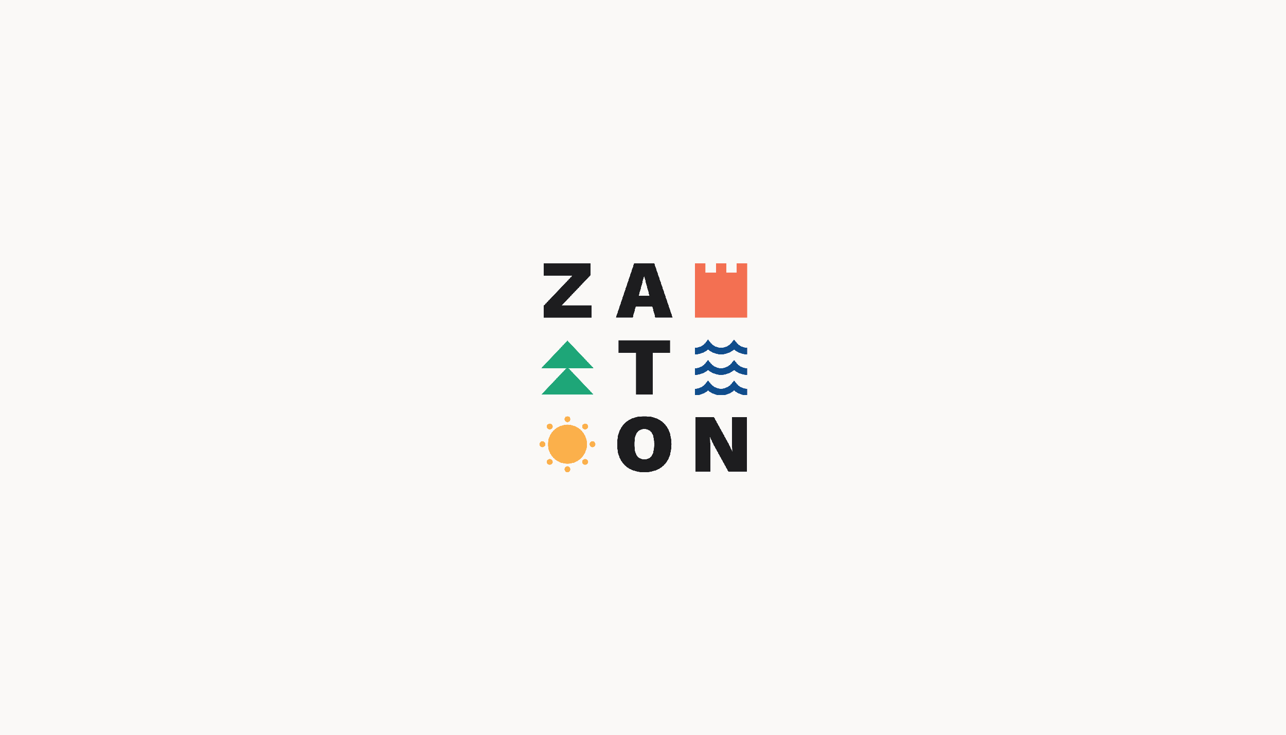
Zaton is a small tourist place ideal for a true vacation and relaxation from the stress of everyday life. It is located near Zadar (12km). Through the creation of this visual, we focused on the combination of elements that the place Zaton offers. Cultural heritage, Mediterranean climate and nature, and accordingly that the Kaštelina tower represents the cultural heritage, the symbol of the sun and the sea represents the Mediterranean climate and the symbol of pine/trees represents the nature that surrounds Zaton. With the play of cheerful tones, and possible variations, we create the playfulness of the logo, which represents the place in a warmer...
Continue reading this project