Zadar Gastro Club
alcoholic drinks, branding, digital communication, entertainment/leisure/culture, event, food, outdoor, poster, publications/media, restaurants/bars, travel/sport/tourism, Zadar Gastro Club
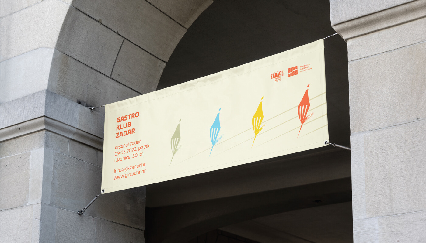
The main focus was on showing the diversity of gastronomy in general, including gastronomy of Zadar through a color system that contains 5 primary colors and their toning. The logo is based on a combination of wine and food, where we created a combination of a fork and a bottle of wine in movement. The display of toning is designed so that it is implemented in the title parts of promotional materials, and that each color represents its own category. Accordingly, blue would represent seafood, green vegetable, yellow cheese food, and red would represent wine/meat which alludes to the diversity of each of the categories. The fork/bottle in the movement...
Continue reading this projectRevival
architecture, branding, digital communication, entertainment/leisure/culture, outdoor, poster, publications/media, Revival, travel/sport/tourism
The main task of this logo was to show the process of conscious culture and change of abandoned buildings. Revitalization is renewal and recovery. It was these terms that served as the inspiration for the creation of this logo. 7 cities in two countries (Croatia and Italy) are participating in the project. Each city has its place within the 7 undeformed elements, and together they form the initial letter of the “Revival” project. The left side of the circle is used to show something new, complete, while the right side shows revitalization and restoration.
Continue reading this projectPorat
alcoholic drinks, branding, entertainment/leisure/culture, non-alcoholic drinks, Porat, restaurants/bars
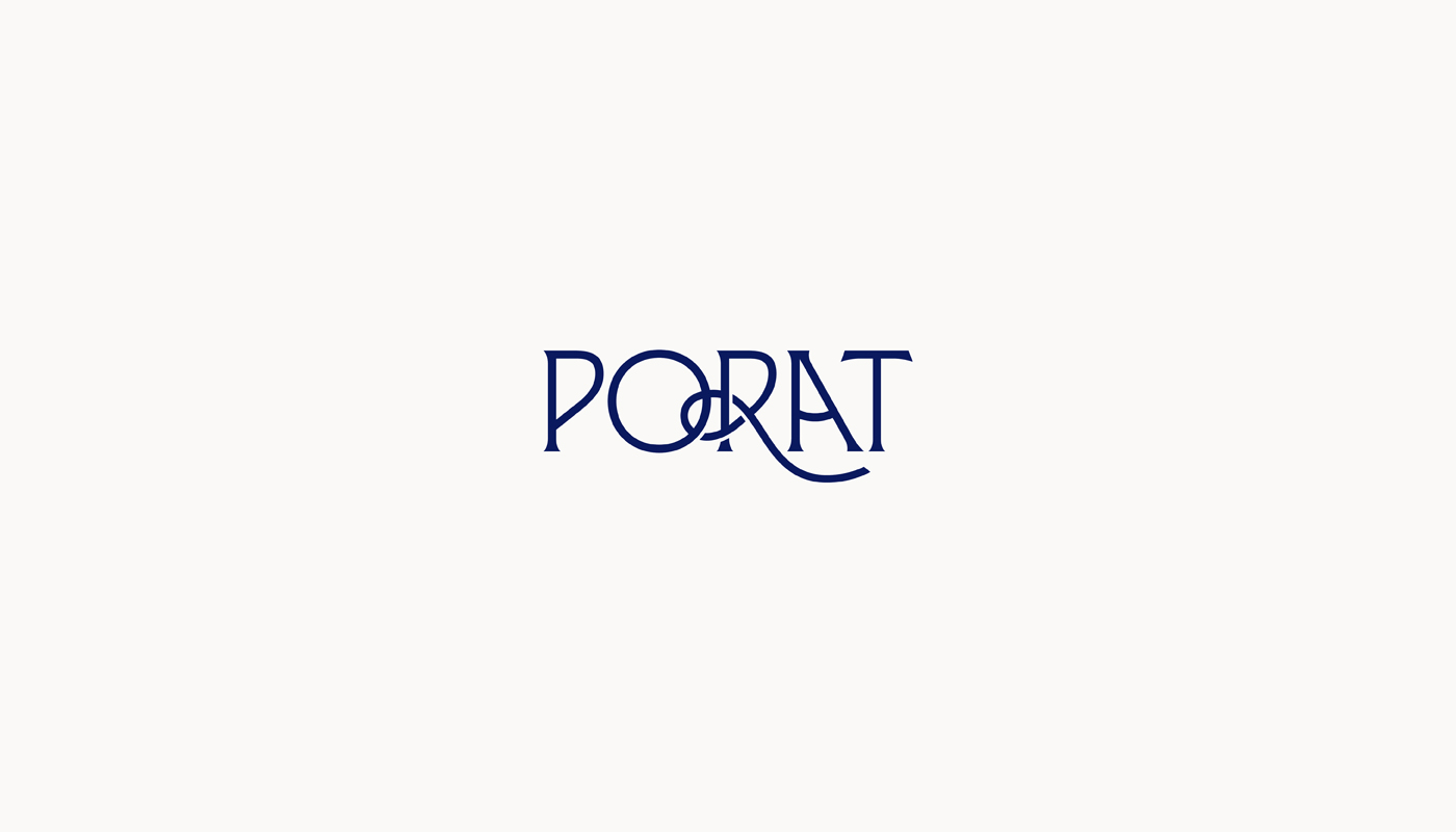
The logo is designed based on the name of the place “Porat” (Port). In the translated sense, the word could be defined as an arranged port that serves as a port for ships, a suitable bay for sheltering from storms. Connecting these elements, they associate us with: naval knots, sails, sun, sea, port, ship, anchorage/anchor, etc. These elements served as the main idea of this project where we wanted to use them to show this visual. Within the typography, the idea is based around the letter R, which forms a naval knot, which is associated with the mooring of ships in the port. To further emphasize the word “Port”, the letter “A”...
Continue reading this project

