Vukovar Nocturne
brochure, entertainment/leisure/culture, print, publications/media, travel/sport/tourism, Vukovar Tourist Board

Vukovar nocturne is a faithful reflection of what was experienced. It is a story of love and courage, strength and pain, human dignity and victory of life. The story of a tragedy of a nation, on victims, heroes, defiance and pride was passed on to Vukovar nocturne which joins all places in town that bear the remembrance of the Homeland war. The Vukovar nocturne is a mosaic of memories, composed of threads that together form a touching, moving and unforgettable whole, woven into the Vukovar truth. We wanted to use the color system to portray “Nocturne” as a sad night mood, which is what Nocturne really is. Black-and-white photographs of...
Continue reading this projectPrivlaka Tourist Board
branding, digital communication, entertainment/leisure/culture, outdoor, Privlaka Tourist Board, travel/sport/tourism
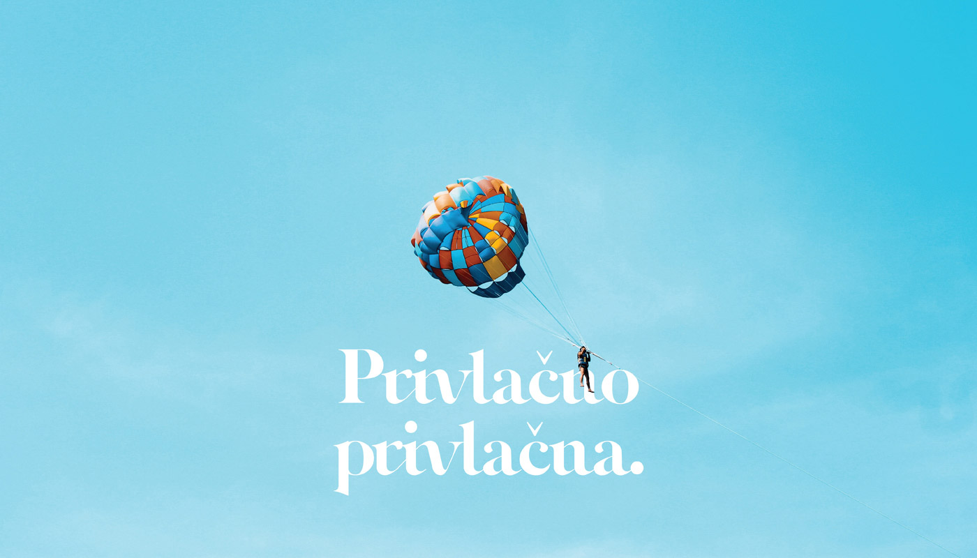
During the rebranding, we focused on achieving a new refreshed visual, while retaining all the elements of the previous one. We connected the elements of seahorse, sea and sand. An important factor was the invention of typography that would refresh the identity and show traditional values. We have also created a slogan which best describes the place – “Simply Attractive” and which offers us a solution to quality and modern advertising. The visual is dominated by blue, while yellow is represented in the secondary elements, and is thus conceived through the further development of identity.
Continue reading this projectVrsi Tourist Board
branding, digital communication, entertainment/leisure/culture, outdoor, travel/sport/tourism, Vrsi Tourist Board
During the creation of the logo, we were based on the diversity of the place Vrsi, and the goal was to show the authenticity of the place through different stories. The basic idea is to make the visual identity cheerful and playful. The logo is based on three elements: (1) sun, vacation, beach, (2) sailboat, boat on the wave (seafaring) and (3) peaks (hence the name Vrsi), pine and forest. We created an interesting combination of letters “S and I” with which we get the horizon where the sunset is looming. Vrsi is also known as place with many beaches, and according to that, we came up with the slogan: “Where all roads lead to the...
Continue reading this project