As this branch is quite complex for the development of an idea/story, and there is no single element around which we can easily build a story, so we went to more complex variants related to technology, although we tried to draw ideas from the industry itself. We focused on presenting a modern and innovative technology firm. The idea is based on the initial letters (S and T) and their combination gave us a creative solution where the typography we modified with two lines is of major importance for the experience that it is a technology company.
Continue reading this projectAdvent in Vukovar
branding, digital communication, entertainment/leisure/culture, event, outdoor, poster, publications/media, travel/sport/tourism, Vukovar Tourist Board
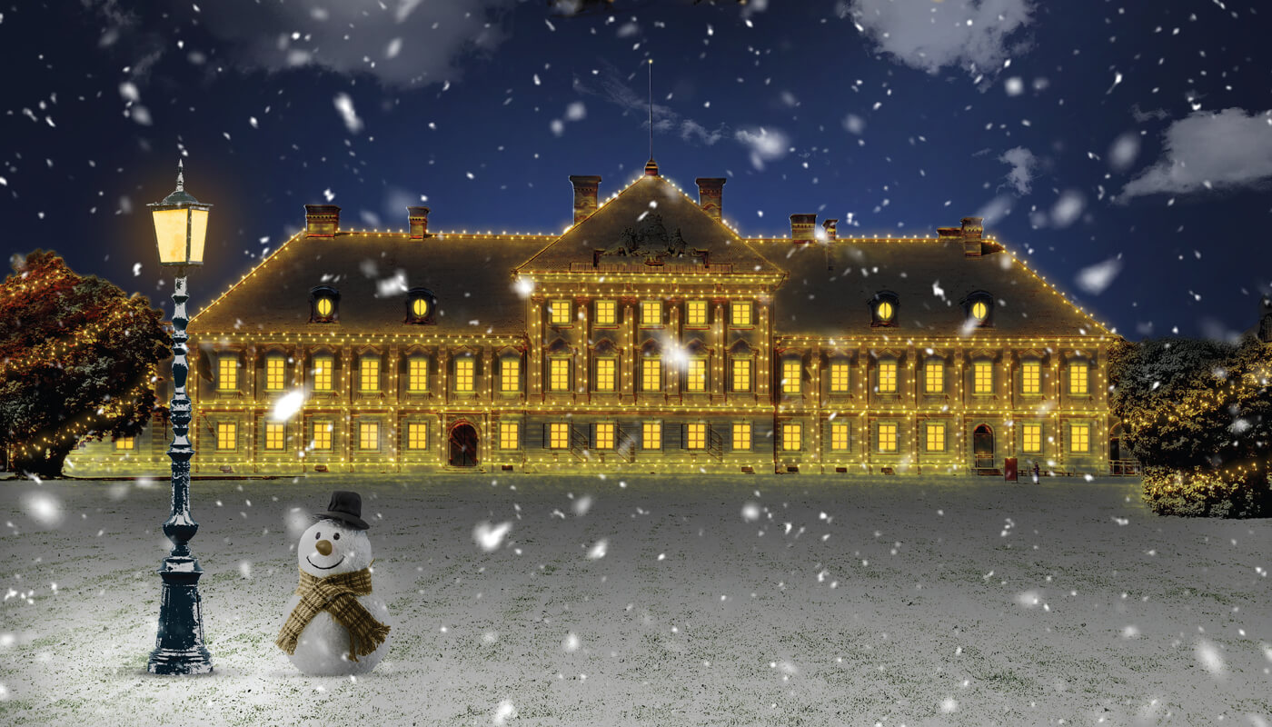
The task was to create a visual identity for Advent in Vukovar 2020, which despite the pandemic managed to survive. We wanted to create a visual that will convey warmth and joy to the audience. We came up with the slogan “Joy, no matter what”, alluding to the situation the world was in at the time. Advent was held in Eltz Castle, therefore, it was a visual starting point. As a reference, we had a daily photo of the castle, and the real challenge was to transform it into a Christmas atmosphere.
Continue reading this projectWe have created a logo that communicates the combination of two families who have decided to turn a traditional restaurant into a modern and contemporary restaurant. As customers already have an idea of a restaurant that retains its old name, it was important to devise a visual that would dismiss the image of the old restaurant. The symbol of the circle lays the foundations of identity, and it was the guiding principle during the creation of visual identity, and we often associate the term “family” with circle symbol. By merging the letters “O” (overlapping), a form of a Gordian knot and a symbol of infinity has been...
Continue reading this project