The atrium in modern architecture is a large open space, often very high and with a glazed roof or with large windows. Carried with the idea of the name and its meaning, we designed the form of the sign A in the form of open space, and we created the background of the story on which the visual can be produced. One of the basic examples is the use of photography in form of A. An interesting detail is that with the letters “I and J” we created a pictogram of a person (bird’s eye view) holding one hand outstretched and the other rounded which is a natural position when making a sketch / draft which is a common term in architecture.
Continue reading this projectPorat
alcoholic drinks, branding, entertainment/leisure/culture, non-alcoholic drinks, Porat, restaurants/bars
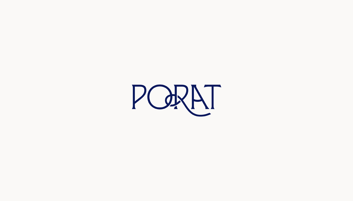
The logo is designed based on the name of the place “Porat” (Port). In the translated sense, the word could be defined as an arranged port that serves as a port for ships, a suitable bay for sheltering from storms. Connecting these elements, they associate us with: naval knots, sails, sun, sea, port, ship, anchorage/anchor, etc. These elements served as the main idea of this project where we wanted to use them to show this visual. Within the typography, the idea is based around the letter R, which forms a naval knot, which is associated with the mooring of ships in the port. To further emphasize the word “Port”, the letter “A”...
Continue reading this projectWe wanted to derive the letters “S” and “P” (Surić & Partners) through the symbol “&” and at the same time get the sign that represents company. The goal was to intervene in the typography and get the “&” symbol as well as the sign. Below you can see a clear elaboration where the initial letters can be read inside the symbol. In relation to typography, the sign always acts as a more prominent element. Serif typography was chosen to portray the company in a serious tone.
Continue reading this project

