We have created a name with two types of fonts, where we emphasize the initial two letters “ze”, which are also used separately as an abbreviation. The square symbol is also included, and through its simplicity we achieve visual results. The goal is to be dominated by minimalism, clear and concrete messages to the target group. The color red was chosen because we wanted to attract attention and show the energy of Ze.Kitch through it.
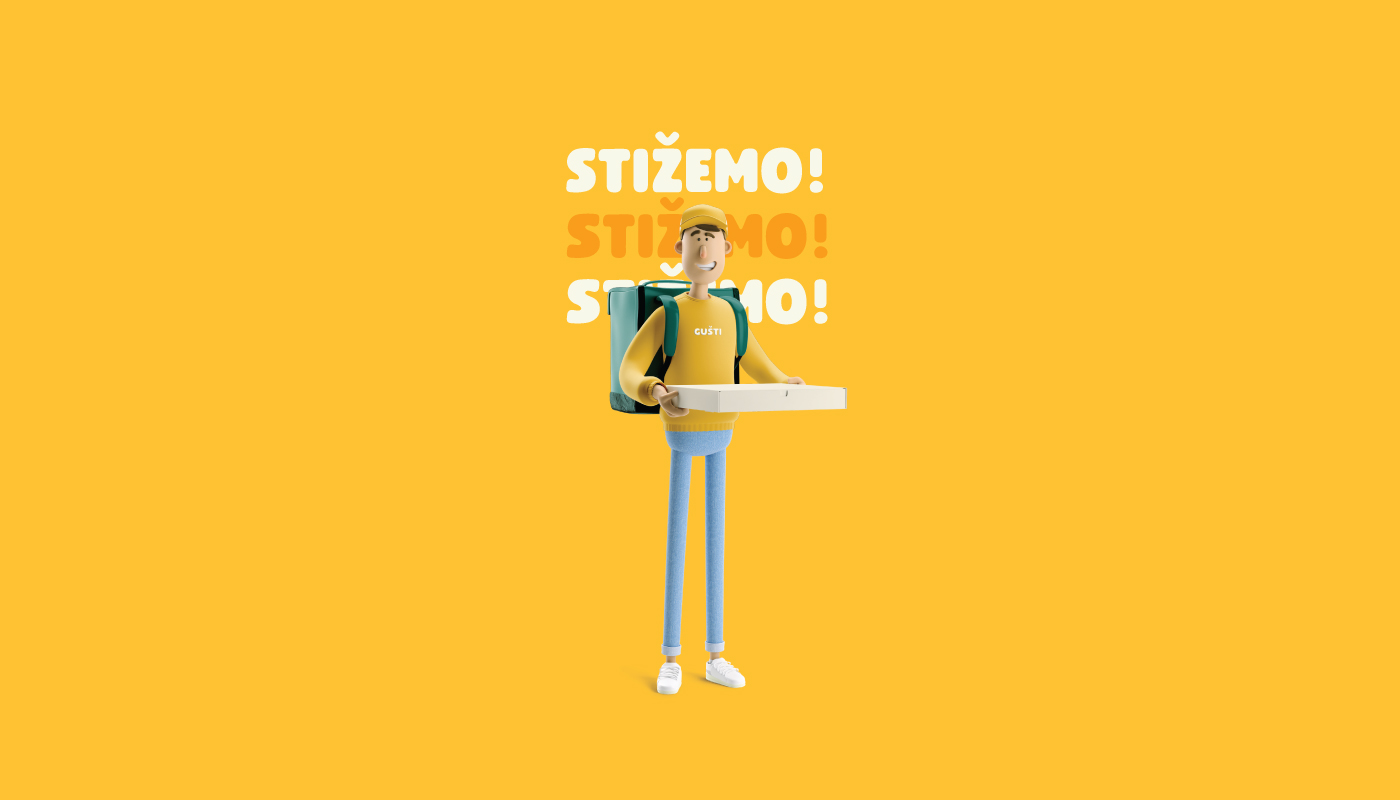
Continue reading this projectWe didn’t have an easy task of rebranding, where the main goal was to set a new brand strategy where we would further emphasize the communication to the outside, ie to the target group. The focus was on food delivery. The logo is based on the pictogram of the location which presents the delivery and has the shape of a pizza cut. The two colors at the top of the sign represent a variety of food. To make the visual easily memorable not only for the adult group, but also for the children, we have included a mascot that appears everywhere as an accompanying element in the visual.
Continue reading this projectRevival
architecture, branding, digital communication, entertainment/leisure/culture, outdoor, poster, publications/media, Revival, travel/sport/tourism
The main task of this logo was to show the process of conscious culture and change of abandoned buildings. Revitalization is renewal and recovery. It was these terms that served as the inspiration for the creation of this logo. 7 cities in two countries (Croatia and Italy) are participating in the project. Each city has its place within the 7 undeformed elements, and together they form the initial letter of the “Revival” project. The left side of the circle is used to show something new, complete, while the right side shows revitalization and restoration.
Continue reading this project

