Zadar Gastro Club
alcoholic drinks, branding, digital communication, entertainment/leisure/culture, event, food, outdoor, poster, publications/media, restaurants/bars, travel/sport/tourism, Zadar Gastro Club
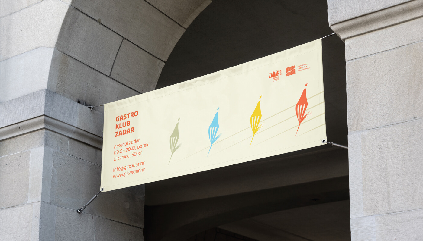
The main focus was on showing the diversity of gastronomy in general, including gastronomy of Zadar through a color system that contains 5 primary colors and their toning. The logo is based on a combination of wine and food, where we created a combination of a fork and a bottle of wine in movement. The display of toning is designed so that it is implemented in the title parts of promotional materials, and that each color represents its own category. Accordingly, blue would represent seafood, green vegetable, yellow cheese food, and red would represent wine/meat which alludes to the diversity of each of the categories. The fork/bottle in the movement...
Continue reading this projectThe concept of visual was to create a unique solution through geometric form and shape that would refer to the activity of architecture. We created a square shape by playing with letters, where the black square functions as a separator of the name, and at the same time helps to define the visual identity and it can be used in other cases. The basic logo is designed as black / white, while the combination with colors is possible when displaying different types of architecture.
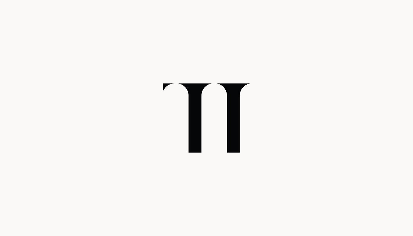
Continue reading this projectThrough creating the visual identity of the TI bar, it was important to show the city of Zadar, but at the same time avoid the already seen elements of the famous sights of the city. TI bar proudly revives all the traditional values of the city of Zadar so that they are not forgotten. The interior is full of details that describe and depict the city of Zadar. Inspired by Zadar itself through history and the strong architectural signature of the Romanesque, we implemented the recognizable semicircular arches into the logo and got the perfect blend of Romanesque and Zadar history. Later, we also designed the TI wine label.
Continue reading this project

