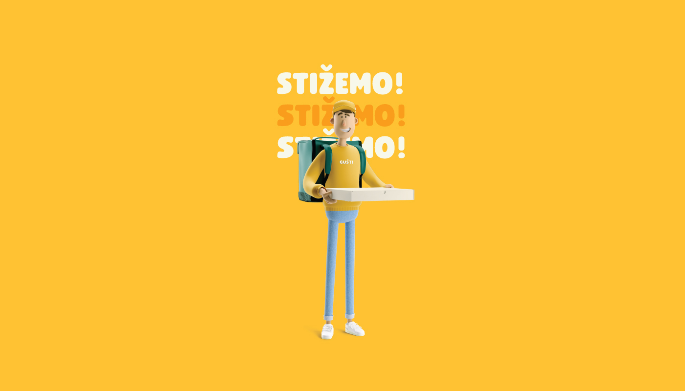
We didn’t have an easy task of rebranding, where the main goal was to set a new brand strategy where we would further emphasize the communication to the outside, ie to the target group. The focus was on food delivery. The logo is based on the pictogram of the location which presents the delivery and has the shape of a pizza cut. The two colors at the top of the sign represent a variety of food. To make the visual easily memorable not only for the adult group, but also for the children, we have included a mascot that appears everywhere as an accompanying element in the visual.
Continue reading this project