Vukovar Nocturne
brochure, entertainment/leisure/culture, print, publications/media, travel/sport/tourism, Vukovar Tourist Board
Vukovar nocturne is a faithful reflection of what was experienced. It is a story of love and courage, strength and pain, human dignity and victory of life. The story of a tragedy of a nation, on victims, heroes, defiance and pride was passed on to Vukovar nocturne which joins all places in town that bear the remembrance of the Homeland war. The Vukovar nocturne is a mosaic of memories, composed of threads that together form a touching, moving and unforgettable whole, woven into the Vukovar truth. We wanted to use the color system to portray “Nocturne” as a sad night mood, which is what Nocturne really is. Black-and-white photographs of...
Continue reading this projectZadar Gastro Club
alcoholic drinks, branding, digital communication, entertainment/leisure/culture, event, food, outdoor, poster, publications/media, restaurants/bars, travel/sport/tourism, Zadar Gastro Club
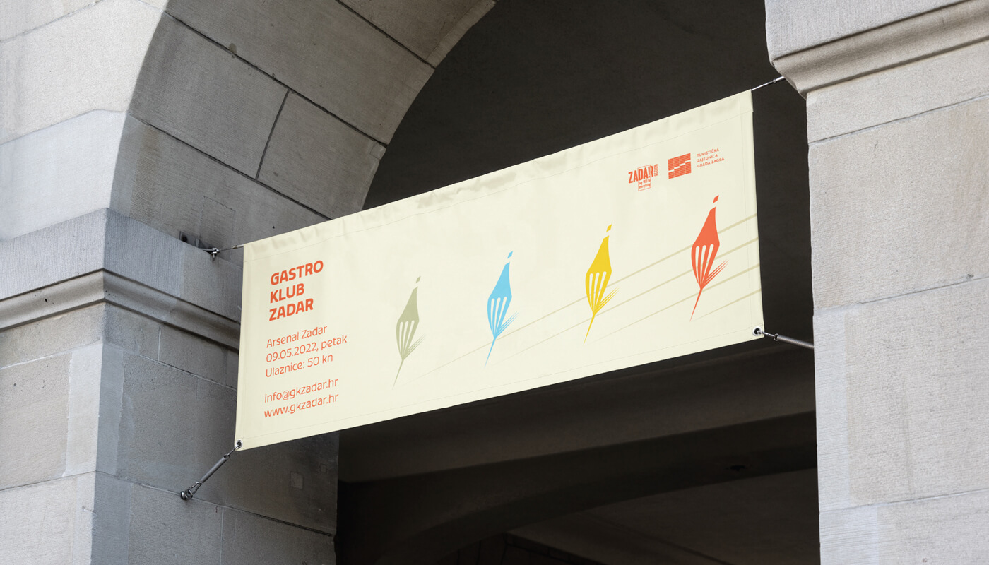
The main focus was on showing the diversity of gastronomy in general, including gastronomy of Zadar through a color system that contains 5 primary colors and their toning. The logo is based on a combination of wine and food, where we created a combination of a fork and a bottle of wine in movement. The display of toning is designed so that it is implemented in the title parts of promotional materials, and that each color represents its own category. Accordingly, blue would represent seafood, green vegetable, yellow cheese food, and red would represent wine/meat which alludes to the diversity of each of the categories. The fork/bottle in the movement...
Continue reading this projectRevival
architecture, branding, digital communication, entertainment/leisure/culture, outdoor, poster, publications/media, Revival, travel/sport/tourism
The main task of this logo was to show the process of conscious culture and change of abandoned buildings. Revitalization is renewal and recovery. It was these terms that served as the inspiration for the creation of this logo. 7 cities in two countries (Croatia and Italy) are participating in the project. Each city has its place within the 7 undeformed elements, and together they form the initial letter of the “Revival” project. The left side of the circle is used to show something new, complete, while the right side shows revitalization and restoration.
Continue reading this project

