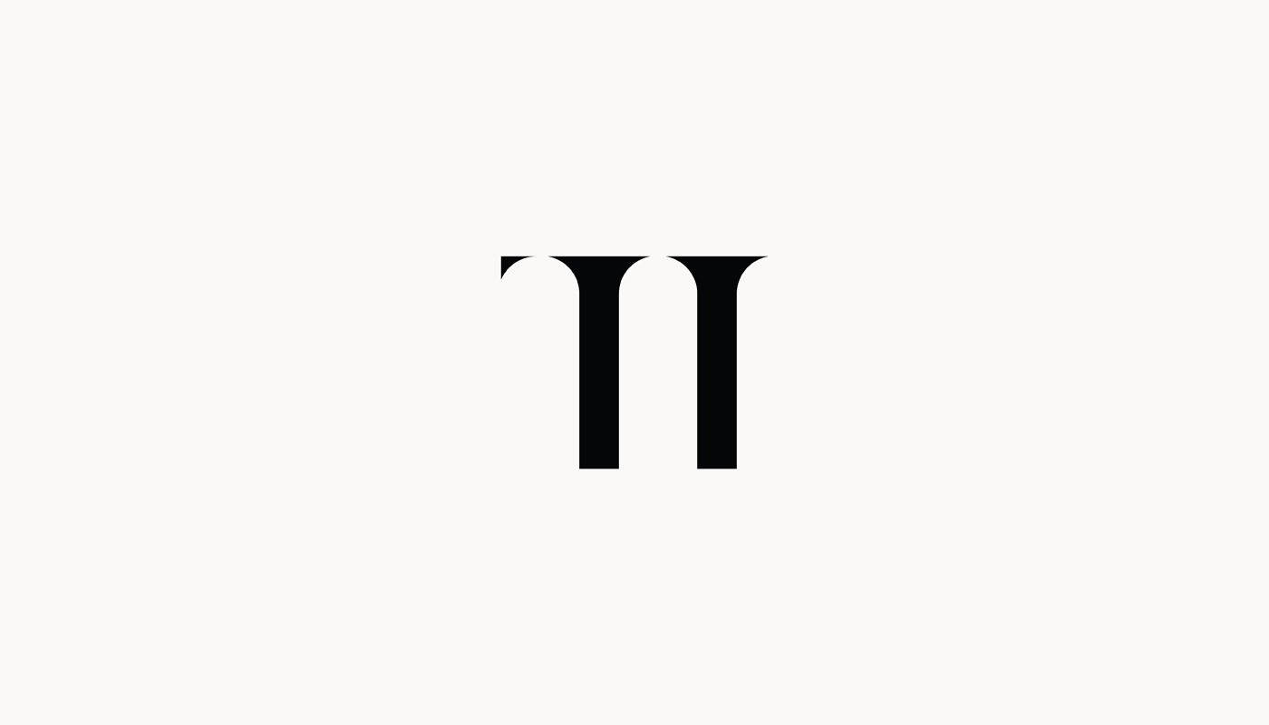
Through creating the visual identity of the TI bar, it was important to show the city of Zadar, but at the same time avoid the already seen elements of the famous sights of the city. TI bar proudly revives all the traditional values of the city of Zadar so that they are not forgotten. The interior is full of details that describe and depict the city of Zadar. Inspired by Zadar itself through history and the strong architectural signature of the Romanesque, we implemented the recognizable semicircular arches into the logo and got the perfect blend of Romanesque and Zadar history. Later, we also designed the TI wine label.
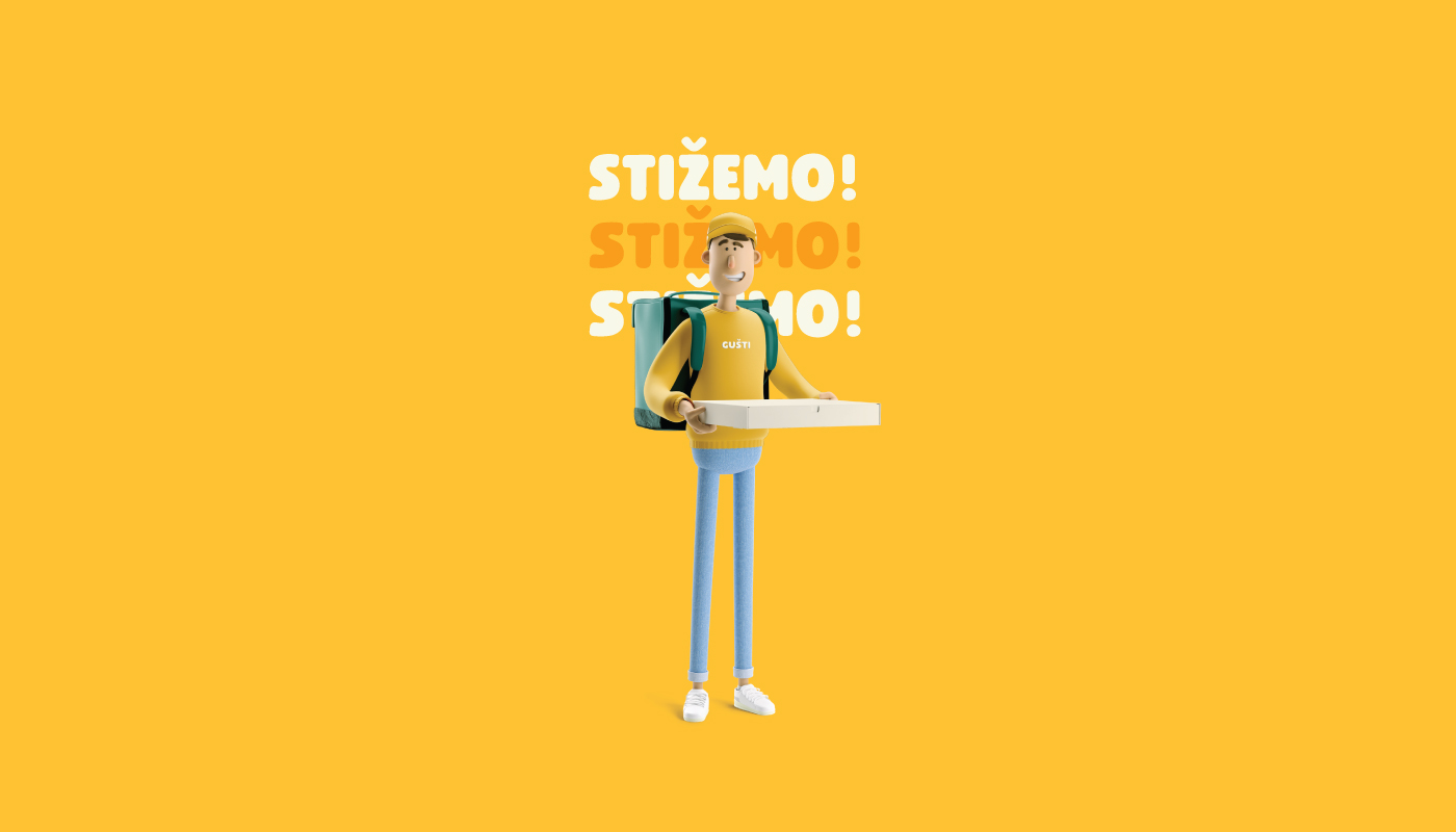
Continue reading this projectWe didn’t have an easy task of rebranding, where the main goal was to set a new brand strategy where we would further emphasize the communication to the outside, ie to the target group. The focus was on food delivery. The logo is based on the pictogram of the location which presents the delivery and has the shape of a pizza cut. The two colors at the top of the sign represent a variety of food. To make the visual easily memorable not only for the adult group, but also for the children, we have included a mascot that appears everywhere as an accompanying element in the visual.
Continue reading this projectGušti Catering
alcoholic drinks, branding, food, Gušti Catering, illustration, non-alcoholic drinks, restaurants/bars, sweet food/snacks
The strategic goal was the design of a contemporary identity and the primary goal was to develop communication and its values in a simple way. With serif typography we create a more serious tone of the company and present it as an elegant organization, and the company name itself contains the letters “C” and “G” which are very similar in form, thus creating an idea behind the sign that will represent the company’s initials. Linearly illustrated hand movements communicate basing on every detail.
Continue reading this project

