Compared to the previous Talvi Travel logo, the form of typography has been retained, but in a modern form, the form of typography (italic) is quite dynamic and adapts very well to the posters and suits the young target group. The strikingness of the typography can be seen through the examples of question messages “let’s go?” which arouses mobility, excitement and intrigue. The logo contains several elements. From connecting the initial letter “T” with the element of the plane – which is our link to the previous visual, and elements of irregular shape that symbolize vacation, fun and communication.
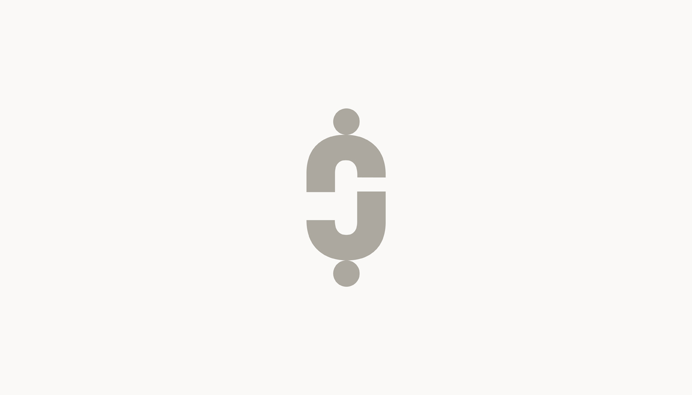
Continue reading this projectWhen we were creating this logo, it was necessary to present the dialogue between the client and the lawyer, ie to bring closer the concept of protection of the client’s rights and help in achieving the goals. Logo is based on the letters “J” and “Č”. Letter signs are symmetrical which helps us to create a geometrically shaped sign. The logo presents the story of the client and the lawyer. No matter how the sign turns, we always see a dialogue between the client and the lawyers extending a hand to each other for the purpose of a successful business. The goal is to show commitment to the client no matter who was on the...
Continue reading this projectThe concept of visual identity was based on the name “Mr.Razor”. We wanted to evoke its sharpness and focus on details, and by modifying the typography we got it. The logo was created by modifying the typography, ie the cutting line at a certain angle of 4°, whose further principle of visual development is based on the same angle as specified on the logo. The cutting line symbolically marks the name and creates a unique communication to the target groups. The identity is dominated by black and white tones with the etching technique used wherever reproduction allows.
Continue reading this project

