Vukovar Nocturne
brochure, entertainment/leisure/culture, print, publications/media, travel/sport/tourism, Vukovar Tourist Board

Vukovar nocturne is a faithful reflection of what was experienced. It is a story of love and courage, strength and pain, human dignity and victory of life. The story of a tragedy of a nation, on victims, heroes, defiance and pride was passed on to Vukovar nocturne which joins all places in town that bear the remembrance of the Homeland war. The Vukovar nocturne is a mosaic of memories, composed of threads that together form a touching, moving and unforgettable whole, woven into the Vukovar truth. We wanted to use the color system to portray “Nocturne” as a sad night mood, which is what Nocturne really is. Black-and-white photographs of...
Continue reading this projectPrivlaka Tourist Board
branding, digital communication, entertainment/leisure/culture, outdoor, Privlaka Tourist Board, travel/sport/tourism
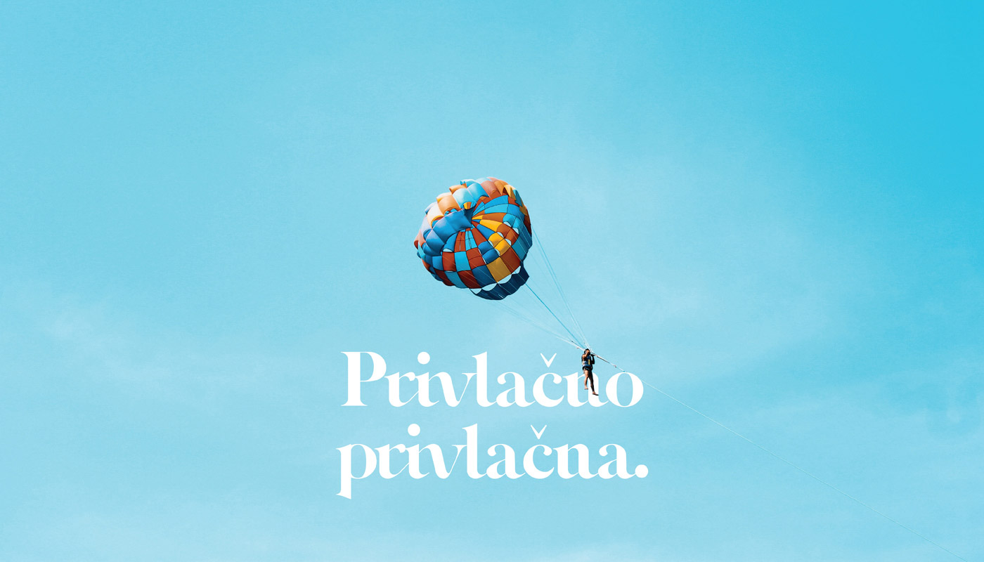
During the rebranding, we focused on achieving a new refreshed visual, while retaining all the elements of the previous one. We connected the elements of seahorse, sea and sand. An important factor was the invention of typography that would refresh the identity and show traditional values. We have also created a slogan which best describes the place – “Simply Attractive” and which offers us a solution to quality and modern advertising. The visual is dominated by blue, while yellow is represented in the secondary elements, and is thus conceived through the further development of identity.
Continue reading this projectAfter the successful branding of the TI bar, it was the turn of the TI wine labels. The focus is still on Romanesque arches from which the logo itself was inspired by the strong signature of Zadar architecture. Wine is obtained from the Plavina variety 50 percent, while the rest consists of Syrah, Babić and Alicante varieties. The wine comes from Radovin, Ravni Kotari. We wanted a label that screams with minimalism and simplicity, and by applying the logo on the bottle, we achieved that.
Continue reading this project