Porat
alcoholic drinks, branding, entertainment/leisure/culture, non-alcoholic drinks, Porat, restaurants/bars
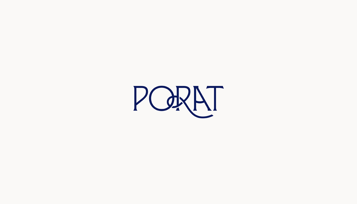
The logo is designed based on the name of the place “Porat” (Port). In the translated sense, the word could be defined as an arranged port that serves as a port for ships, a suitable bay for sheltering from storms. Connecting these elements, they associate us with: naval knots, sails, sun, sea, port, ship, anchorage/anchor, etc. These elements served as the main idea of this project where we wanted to use them to show this visual. Within the typography, the idea is based around the letter R, which forms a naval knot, which is associated with the mooring of ships in the port. To further emphasize the word “Port”, the letter “A”...
Continue reading this project