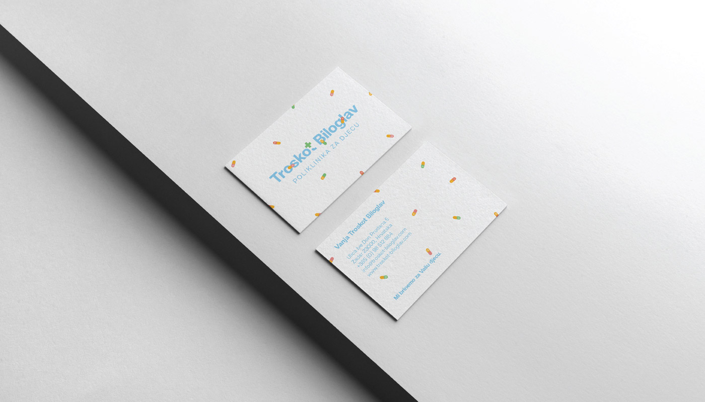
If we look from a child’s perspective, one of the first associations to pain and healing is the band -aid. Often children’s first game are doctor/patient game, and the band-aid is one of the first things they apply. It is not our goal to show that pain is solved with a band-aid, but often this child’s crying magically stops by putting on a band-aid, and this is what we subconsciously want to achieve by children entering the clinic, to feel safe and happy. In order to contribute to a clearer understanding that this is a health institution, the letter “t” in the form of a plus symbol has been modified. The combination of...
Continue reading this projectWe wanted to achieve harmony, purity and a sense of trust with this visual identity. The eyes predominate in the logo as the main element. The logo was created through the way it shows the three basic segments of the eye, ie it is divided into three fields (pupil, iris, sclera). The line view of the eyes is used as diplopia (double vision). Through this symbol we build a story where we position the sign in the place of the eye through promo materials. During color selection, we wanted to get out of the comfort zone of blue, which is the most common in the area of eye care. It was a focus on softer shades in which prevails a sense of calm. Two mild...
Continue reading this project
