Revival
architecture, branding, digital communication, entertainment/leisure/culture, outdoor, poster, publications/media, Revival, travel/sport/tourism
The main task of this logo was to show the process of conscious culture and change of abandoned buildings. Revitalization is renewal and recovery. It was these terms that served as the inspiration for the creation of this logo. 7 cities in two countries (Croatia and Italy) are participating in the project. Each city has its place within the 7 undeformed elements, and together they form the initial letter of the “Revival” project. The left side of the circle is used to show something new, complete, while the right side shows revitalization and restoration.
Continue reading this projectCompared to the previous Talvi Travel logo, the form of typography has been retained, but in a modern form, the form of typography (italic) is quite dynamic and adapts very well to the posters and suits the young target group. The strikingness of the typography can be seen through the examples of question messages “let’s go?” which arouses mobility, excitement and intrigue. The logo contains several elements. From connecting the initial letter “T” with the element of the plane – which is our link to the previous visual, and elements of irregular shape that symbolize vacation, fun and communication.
Continue reading this projectAdvent in Vukovar
branding, digital communication, entertainment/leisure/culture, event, outdoor, poster, publications/media, travel/sport/tourism, Vukovar Tourist Board
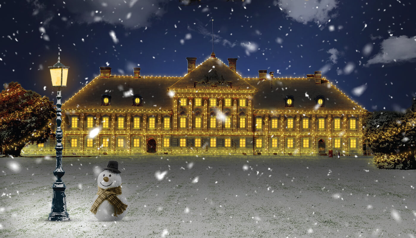
The task was to create a visual identity for Advent in Vukovar 2020, which despite the pandemic managed to survive. We wanted to create a visual that will convey warmth and joy to the audience. We came up with the slogan “Joy, no matter what”, alluding to the situation the world was in at the time. Advent was held in Eltz Castle, therefore, it was a visual starting point. As a reference, we had a daily photo of the castle, and the real challenge was to transform it into a Christmas atmosphere.
Continue reading this project