Client: Surić & Partners
Studio: SuperKul
Project: Visual identity
Category: Law
Date: February 2021
City: Zadar
Surić & Partners

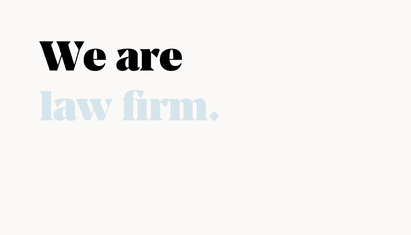
We wanted to derive the letters “S” and “P” (Surić & Partners) through the symbol “&” and at the same time get the sign that represents company. The goal was to intervene in the typography and get the “&” symbol as well as the sign. Below you can see a clear elaboration where the initial letters can be read inside the symbol. In relation to typography, the sign always acts as a more prominent element. Serif typography was chosen to portray the company in a serious tone.


